Final Designs
PayU
Add project visuals here
End-to-end redesign of PayU's merchant mobile app — from deep discovery through a full Double Diamond process to high-fidelity delivery. Tackled 30.87% negative-sentiment UX issues, a 32% product-engagement churn, and zero cross-sell discoverability. Rolled out to 125k+ merchants.
The PayU Super App project aims to create a comprehensive, user-friendly, and merchant-centric super app to address existing problems in the PayU application. The app offers an all-in-one solution for payments, financial services, and business management — allowing merchants to efficiently manage their operations and finances.
We noticed an upward trend in negative sentiments around the app. Upon further analysis, we found that bad UX was contributing 30.87% to the overall negative sentiment. Looking deeper at support escalations revealed new problem sets:
Secondary research with the business revealed a critical funnel collapse. Of 12,556 app users, only 32% engaged with any PayU product — meaning 68% of onboarded merchants were either unaware of or unable to access the product suite.
Before redesigning, it was critical to understand the merchant base composition. PayU's 20,944 active merchants span diverse sectors and usage patterns — grouped into three distinct cohorts based on how they interact with the platform.
A feature parity audit between the web dashboard and mobile app revealed that many critical merchant tools were available on web but entirely absent from mobile — forcing merchants back to desktop or competitor apps.
After establishing purpose through secondary research, I conducted primary user interviews with existing PayU merchants across categories — investment advisors, SMB merchants, and transport businesses — to extract needs, pain points, and behavioral patterns.
Desk research against PhonePe, Razorpay, Stripe, and Google Pay revealed clear patterns in what best-in-class merchant apps do that PayU didn't — setting a clear benchmark for the redesign.
| Feature | PayU (Redesign) | PhonePe | Razorpay | Stripe | GPay |
|---|---|---|---|---|---|
| Dashboard Overview | ✓ | ✓ | ✓ | ✓ | ✗ |
| Payment Links | ✓ | ✗ | ✓ | ✓ | ✗ |
| QR Code Payments | ✓ | ✓ | ✓ | ✗ | ✓ |
| Invoicing + Inventory | ✓ | ✗ | ✓ | ✓ | ✗ |
| Transaction Reports | ✓ | Partial | ✓ | ✓ | ✗ |
| Native Customer Support | ✓ | ✓ | Chat only | Email only | Help centre |
| Cross-Sell / Up-Sell | ✓ | Partial | ✓ | ✓ | ✗ |
| Priority Settlement | ✓ | ✗ | Partial | ✗ | ✗ |
| Mobile-First Design | ✓ | ✓ | Partial | ✗ | ✓ |
| Biometric Authentication | ✓ | ✓ | ✓ | ✓ | ✓ |
| In-App Notifications | ✓ | ✓ | ✓ | Email only | Partial |
| Training Videos / Onboarding | ✓ | ✗ | Partial | ✓ | ✗ |
| Cashback / Offers for Merchant | ✓ | ✓ | ✗ | ✗ | Partial |
| Vernacular / Regional Dashboard | ✓ | ✓ | ✗ | ✗ | Partial |
Analysing App Store and Play Store reviews from PayU merchants surfaced a consistent pattern of complaints. 30.87% of all reviews contained UX-related negative sentiment, clustering into three major themes that directly informed redesign priorities.
Merchants consistently complained about delayed and inaccessible support. No in-app chat, no escalation path, and no resolution tracking made disputes frustrating to resolve.
The app was difficult to use for merchants unfamiliar with English interfaces. Tier 2/3 city merchants and non-tech-savvy users struggled with navigation, layout complexity, and the absence of vernacular language support.
Merchants were unaware of additional PayU products — priority settlement, business lending, QR codes — because no in-app discovery existed. Cross-sell recommendations were entirely absent from the merchant experience.
Based on interview responses, I designed three user personas representing the primary segments of PayU's merchant base. These personas guided every design decision throughout the project.
Mapping the journey of an Apple Authorised Service Centre owner through the PayU app revealed exactly where frustration and confusion peaked — and where opportunity lay to convert cautious users into satisfied ones.
Interview data was synthesised into user statements, insights, and concrete design opportunities — forming the bridge between research and solution design.
Using MoSCoW analysis for idea prioritisation, I clustered features into four groups to align the team on a realistic Phase 1 scope without sacrificing the most critical merchant needs.
Every screen was designed with the three personas in mind — ensuring first-time users could onboard with confidence, power users could transact in seconds, and all merchants could discover and use the full PayU product suite.
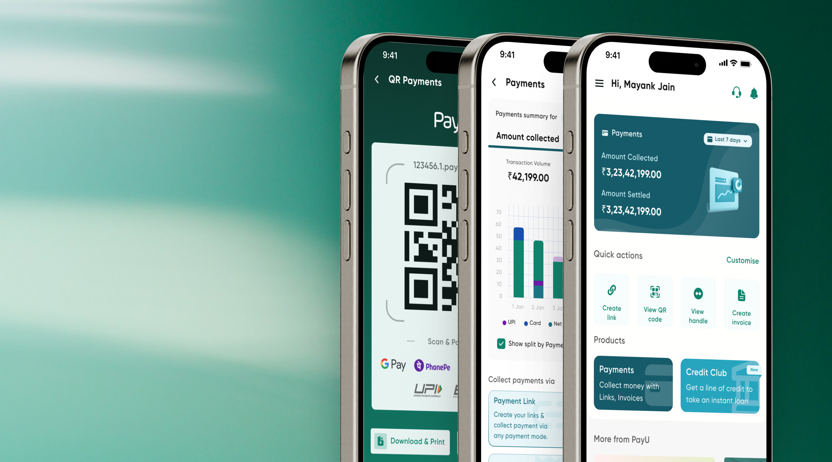
Welcome to the redesigned PayU Mobile App, where simplicity meets power. The new Home Screen provides a seamless and intuitive experience — empowering merchants to manage payments effortlessly with the full product suite one tap away.
Experience the future of seamless transactions with QR Code Payments — the fastest, safest way to pay and receive. Payment invoicing was redesigned with item-level inventory management, directly addressing Sajid's top pain point.
The application was tested using an unmoderated usability study by rolling out to 30% of existing PayU merchants in Apr–May 2023 (~38k users). Participants were categorised by platform usage — app-only, dashboard-only, and both. KPIs tracked TAT comparison, user error rates, conversion rates, and app engagement.
The first rollout to 30% of merchants in April–June 2023 validated the redesign direction decisively across every key metric.
After the 30% success, the app was rolled out to 100% of merchants in August 2023 — replicating and extending the gains at more than 3× the user base.
The redesigned PayU Super App is live for all merchants. After a successful 30% rollout and full deployment in August 2023, the app is now available to download and use. I'd love to hear what you think of the experience — download it and let me know.
Data without context misleads. The funnel showed 32% engagement — but without interviews we'd have built the wrong solution. Research sequencing matters enormously.
Feature parity is not the goal. Web-to-mobile parity was a starting point, not a solution. The real goal was to redesign for mobile-native mental models.
Phased rollout is underrated. The 30% rollout gave us real signal before committing to 100% — and the metrics were strong enough to justify full deployment without further iteration.
I would invest more time upfront in longitudinal diary studies to understand how merchants' workflows evolve over time — not just single-session pain points.
The competitive analysis leaned heavily on global fintech benchmarks. Indian SMB merchant usage patterns — especially in Tier 2 and 3 cities — have significant nuance that desk research alone can't capture.
I'd also push harder for native lending onboarding in Phase 1 — the interview data clearly showed demand, but it was deprioritised due to engineering constraints.