Final Designs
DS
Add project visuals here
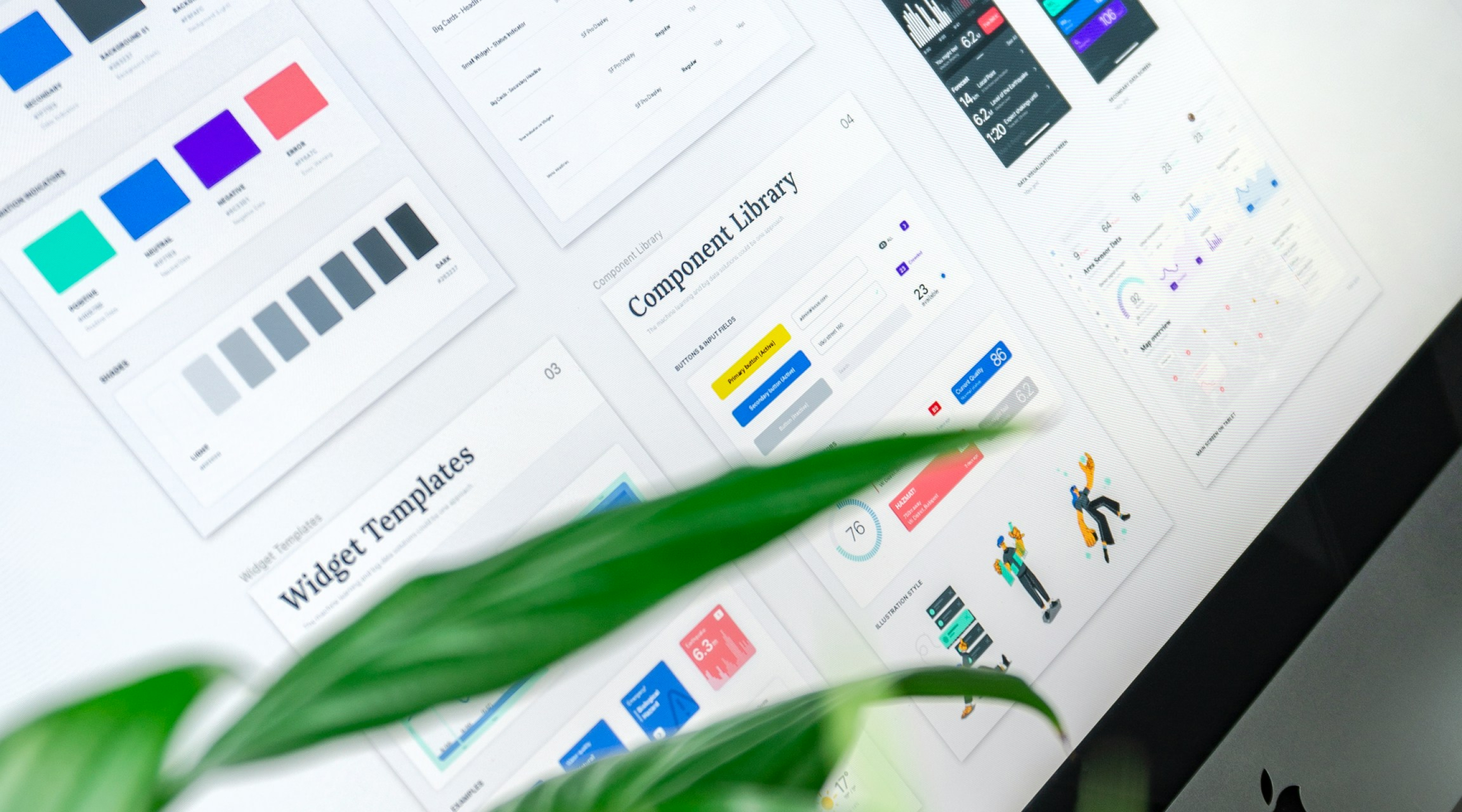
A unified component library and token system that transformed how 50+ designers and developers at PayU shipped product — from inconsistent interfaces to a single source of truth.
PayU is a leading fintech company serving merchants across South Asia, Latin America, and Europe — processing millions of transactions daily across web and mobile platforms.
As one of India's most widely used payment gateway providers, PayU's product suite spans merchant dashboards, consumer apps, B2B integrations, and admin tools. The sheer scale of the product — built over a decade with multiple teams — had resulted in fragmented, inconsistent UI across products.
My mandate was to design and implement PayU's first unified design system: a shared language across products, from raw design tokens to fully documented, production-ready components.
Years of product growth without a unified system had left PayU's UI fragmented — each team building components independently.
Designer interviews, codebase audits, and stakeholder conversations revealed a consistent pattern: developers were re-implementing the same components over and over, QA was catching visual regressions on every release, and designers couldn't hand off specs with confidence. The cost was enormous — in time, in inconsistency, and in user trust.
The project was structured in four phases over 6 months — each building on the last. We used a "crawl → walk → run" approach, starting with tokens before touching a single component.
With 240+ elements audited, we needed a clear prioritisation framework. We plotted components on an Impact vs. Effort matrix to determine sequencing — starting with high-impact, low-effort "quick wins" that would demonstrate value fast.
What success looks like
A designer should be able to open any Figma file, find the component they need in under 30 seconds, know it's correct, accessible, and approved — and hand it off to a developer who can implement it without a single back-and-forth clarification.
Constraints to design around
The system had to work within existing brand guidelines, be backward-compatible with live products, support dark mode from day one, and be maintainable by a small team without dedicated engineering resources.