SK.
Sagar Kumar
Portfolio · © 2026
All Work
B2B SaaS · FinTech · Compliance · 2023

KIID Repository
Document Intelligence

A centralised, searchable document hub for fund managers — replacing scattered drives and email chains with a structured compliance-grade repository powered by intelligent search (iKE) and automated audit trails.

Client
Morgan Stanley (FinTech SaaS)
My Role
Lead UX/UI Designer
Platform
Web SaaS
Duration
4 Months · 2023
Focus
Compliance · Search UX · IA
Visual Designs
KIID — Document Intelligence Repository
01 — Problem Statement

What problem are we solving?

Interactive commentary to enhance client & Financial advisor collaboration on documents. Global distribution of the Digital file Repository with multiple channels. Overview analysis capabilities of all the Global Repositories. Encrypted cloud based document storage & sharing between the Client and Financial Advisor in a central location.

From the user's perspective
Keep it broad
Who, what, where, and why
Make it manageable
02 — Goal

What are we building towards?

The goal is to understand the current landscape & help in-house users analyze and segregate the importance of repository counts and data. To design a Repository management portal considering reducing cognitive load. To provide a modern customer experience to various modules of the organization.

The KIID and/or KID contain essential information and key facts about the UCITS fund aimed at helping investors make informed investment decisions about whether the particular fund meets their needs.

Outcome 1
Centralised repository for KIID/KID documents with easy management & access for administrators
Outcome 2
Dynamic, intelligent iKE search to surface documents in under 30 seconds
Outcome 3
Automated alerts for document updates, expirations & DLM task management
03 — Our Team

Who built this

4 Designers
Offshore Team
1 Designer
Onshore
2 Product Owners
Product Leadership
Infosys Dev Team
Engineering
04 — My Role

What I led

01
Understand the current environment/product, analyse the gaps through Heuristic evaluation.
02
Build a design strategy based on user needs & business goals.
03
Manage feedback loops with the key stakeholders & visualise the product.
05 — Design Process

Double Diamond + Scrum

Applied the Double Diamond diverge–converge framework with a focus on Purpose (the outcome), People (the involvement) and Process (the flow) — running within 2-week Scrum sprints from Product Backlog through to Build Increment and MVP.

Phase 01
Discover
Business User, Data Analyst, Product Designer (UX)
Business Goals, Product Data, Product Goals — using HEART & AARRR frameworks. MCA methodology.
Phase 02
Define
Product Manager, Product Designer (UX), Business User
User Journey, AIMC Recommendations — narrowing scope, focus on specific problems.
Phase 03
Design
Product Designer (UI/UX), Business User
Wireframes, User Stories, Prototype, Prototyping Methods — exploring possible solutions with available resources.
Phase 04
Deliver
Product Manager, Product Designer (UI)
Hi-fi Prototype, User Stories, Metrics — defining concrete, feasible solutions to these problems.
Phase 05
Develop
Developer, Product Manager
Metrics, Build Increment — explore technical approach, develop solutions into the product.
Phase 06
Distribute
Developer, Data Scientist, Product Manager, Product Designer (UI)
Analytics/Insight, Product Backlog — track success metrics, plan improvement.
Scrum Context
Product Vision & Goals
→ Product Backlog → Sprint Plan
Sprint Backlog
→ Daily Scrum
Sprint Review
Track & Analyse
Build Increment → MVP
Developers
06 — Research

Affinity Mapping

We started with Affinity mapping where we sorted ideas into different groups or categories based on their relationships to one another — clustering pain points, journey moments, and opportunities from contextual inquiry sessions.

Storage
No canonical location — documents exist across 4+ drives, email, and personal folders with no master index
Retrieval Pain
Search completely broken — filenames inconsistent, no tags, no metadata, no shared conventions
Compliance
No audit trail — version history is manual, unreliable, often absent when regulators ask
Approval Flow
Every manager runs a different approval process — email, paper sign-off, chat — nothing standardised
Access Control
Everyone sees everything — no role-based permissions, no visibility scoping across regions or teams
Trust Gap
No confidence a found file is the latest approved version — teams routinely send wrong documents
SLA Risk
Audit SLA breach: 1–3 day retrieval time vs. the minutes regulators expect during live reviews
Mental Model
Users think Fund → Doc Type, not folder path → filename. The system's structure fights their instincts
07 — Benchmark Analysis

Competitive Landscape

Product benchmarking helped us identify the strengths and weaknesses of existing tools and identify market leaders based on the benchmarks established.

GitHub
Option to follow changes or updates across repositories
Tagging for easy search and categorisation
Information regarding the versions of the repository with full commit history
Microsoft Teams
Recent files for easy access across channels
Option to refresh or update the repository in real time
Categorisation by the services and team channels
Google Cloud
Option to personalise the view for different user types
Bookmark important files for quick access
Google Drive
Choice of layout — grid or list view
Recommendation engine for frequently accessed files
Option to sort by name, date modified, or owner

Compared various direct and indirect competitors to understand existing features in the market as well as other UX metrics like usability, satisfaction and ease of the product.

08 — Stakeholder Interviews

Voices from the field

Stakeholder interviews are a great way to get the lay of the land. It helped us to understand user behaviour, distinguish constraints, and identify pain points. At the beginning of a UX research and design project a Stakeholder Interview should be conducted in order to find out:

01
Can you walk us through some of the most common pain points you hear from users during this process? What keeps coming up? What is working well?
02
What information do users need to provide for returns? How do they access that information?
03
What are your own needs, motivations and goals specific to your area of Repository handling?
04
What constraints might be somehow in the way of achieving those goals?

Key Insights

1
The elimination of departmental barriers so everyone has a common objective or objectives driven by corporate management.
2
Having a central location to collect, store, and report KPI data makes it much easier to manage metrics that are unified around a strategy map.
3
Within the dashboard, KPIs are presented in a manner that gives executives enhanced analytical insights, showing not only the current levels of performance against each KPI, but providing the capabilities to create "what-if" scenarios and exception reports.
4
Users cannot prioritize making repository assigning calls to users and check progress without a centralised system.
5
Data Visualization needs to be easy to comprehend, reducing cognitive load — users think visually, not in tables.
6
Making the need for change visible and the opportunity for improvement clear, helping to close the loop in the performance management cycle.
09 — User Journey Mapping

CJM — Julie Lepage

JL
Julie Lepage
Reporting Overview · Fund Manager
Julie is responsible to manage different aspects of a repository all in one place, rather than having to traverse several menus and tabs to manage each of the aspects separately.
"Anything that saves time is great"
Anticipating Explore Filter Search View / Export Find Other Reports
Tasks Will be able to monitor and analyze the repositories easily & hassle-free. Find repositories for different departments and reports required. Export/View the required data from reports. Goes to Reports section from Primary Navigation. Finds the required report in the Recent/past reports. Couldn't find it in recent reports. Browses through different report sections through different Geographical views. Selects the required account. Selects the date range. Sorts based on report number etc. Views list of reports. Types the required report number in search field. Search results are generated as a list. Selects report to view in browser. Click on generate report. Select fields to export report. Select format. Click export/download. Using the breadcrumb, goes back to overview home page. Clear filter options. Find other reports.
Positive experiences Dedicated page for report & analysis. Quick understanding of transactions/finances. Quick access to all reports. Do multiple analysis and go back and forth between reports.
Negative experiences Couldn't find the required report, navigated to different sections. Tried multiple combinations in filter, but results were not found. Got confused how to go back to the main screen/remove filters.
Feelings 😊 Optimistic 😐 Neutral → Frustrated 😐 Uncertain 😊 Hopeful 😊 Satisfied 😊 Recovering
10 — Information Architecture

System Structure

Information architecture aims at organising content so that users would easily adjust to the functionality of the product and could find everything they need without big effort. IA is a science of organising and structuring content of websites, web and mobile applications, and social media software.

USER LOGIN
UNIQUE COUNT
(Default Tab)
BY ORGANISATION
BY COST CENTRE
NAVIGATION / SIDEBAR
SETTINGS
Volume Counts → Repository Counts
Ownership Status → Storage Count
TAI Ownership Status → File Count
Repository Usage Counts → Container Count
SharePoint
Sharedrive
No ISTO
H.R Organisation
Volume Counts → Repository Counts
Ownership Status - Self → Storage Count
Repository Usage Counts → File Count, Container Count
WM Technology
Institutional Securities Tech
Corporate Fundings
Technology Risk
Enterprise Tech & Service
IM IT
Financial Cost Centre
HR Cost Centre
IM Cost Centre
Data Validation
iKE Search
My Repositories → Volume Counts → Repository Counts
Admin View → Ownership Status → Storage Count
Team Leads View → TAI Ownership Status → File Count
Alerts → Repository Usage Counts → Container Count
SharePoint
Sharedrive
No ISTO
User Profile
Logout
11 — User Flows

Navigation Paths

There are many different paths that users can take. User flows are often modelled as flow charts with nodes for each of the major navigational paths. The purpose of user flow analysis is to identify the main user flows through your app or website, and identify areas where the navigational flow can be improved.

IM USER LOGIN
Admin View / Summary
My Team Rep (Home)
Explorer
RO
Explorer → Summary (showing total count of the MS Firm View, including both HR/CC)
Geography
Types of Rep
Divisions
Geography
New York
India
Sweden
Oceania
Types of Rep
SharePoint
Share Drive
Divisions
HR Org Unit
CC Org Unit
Super Div / Div
Super Dep / Dept
Orgs (Legal) / Org 2
Team 1
Team 2
Team 3
John
Sam
Tony
Repository Card
12 — Ideating & Design Phase

From Sketch to Structure

A simple pen & paper low fidelity wireframe designed, based on Client interaction which leads us to understand the point of view from the user research perspective.

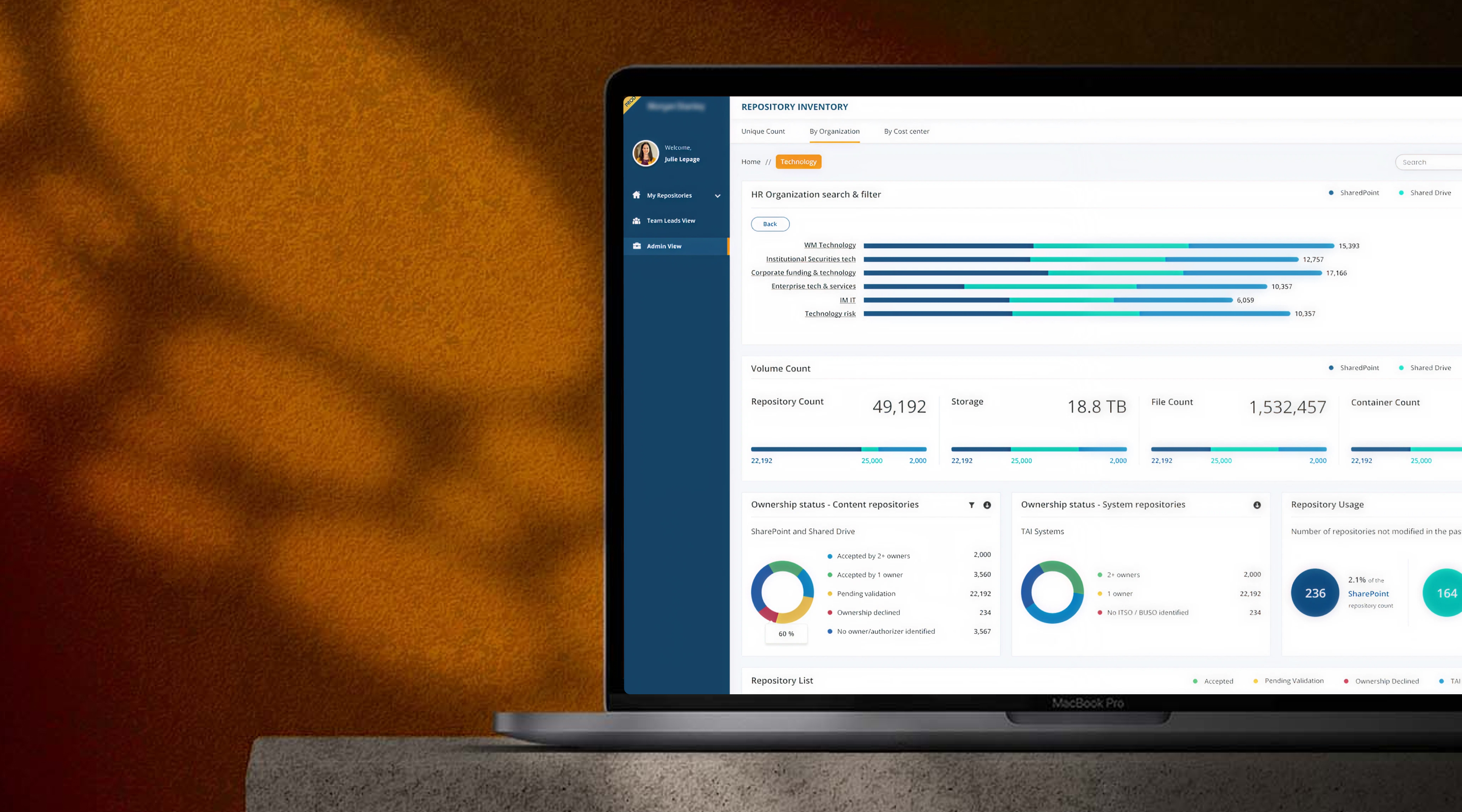
Repository Inventory — Lo-fi
Admin Dashboard — Mid-fi
iKE Search — Lo-fi Sketch
Summary Page — Lo-fi Sketch
Alerts Panel — Mid-fi
My Repositories — Mid-fi
13 — Solution Approach

How we solved it

Information architecture aims at organising content so that users would easily adjust to the functionality of the product and could find everything they need without big effort. IA is a science of organising and structuring content of the websites, web and mobile applications, and social media software.

1
Using cyber-connection to enhance the User experience — enabling seamless, secure communication between distributed repository systems and end users.
2
Easy filter and segregation of data — fund managers can slice the repository by fund, document type, geography, organisation, cost centre, or ownership status in seconds.
3
Providing access levels and permissions — a 4-tier role model (Viewer, Editor, Approver, Admin) ensures the right people see the right documents with a full audit trail generated automatically.
4
Reducing cognitive load — the entire interface is designed around the fund manager mental model: navigate by fund or organisation, not by folder path or filename, with iKE AI search as the power user shortcut.
14 — Design System

Components, Typography & Colour

Built a component library purpose-made for document management interfaces — data-dense but never cluttered. Every decision optimised for speed of information retrieval under cognitive load.

Components
KIID KID Prospectus Approved Pending Review Expired
Typography Scale
H1 / 60px
Good design is good business
H2 / 48px
Good design is good business
H3 / 40px
Good design is good business
H4 / 32px
Good design is good business
Body / 14px
Good design is good business
Caption / 12px
Good design is good business
Colours
MSO Blue
#1B9ABA
4.63 : 1
MSO White
#FFFFFF
21.0 : 1
MSO Black
#333333
11.79 : 1
MSO Teal
#62E1E3
13.43 : 1
Visual Design

High Fidelity Screens

Final UI designs for the KIID Repository platform — covering the document intelligence dashboard, alert management, and repository views.

Coming Soon
Final visual designs are being prepared and will be added here shortly.
Explore More Work
See all projects →
Back to All Work